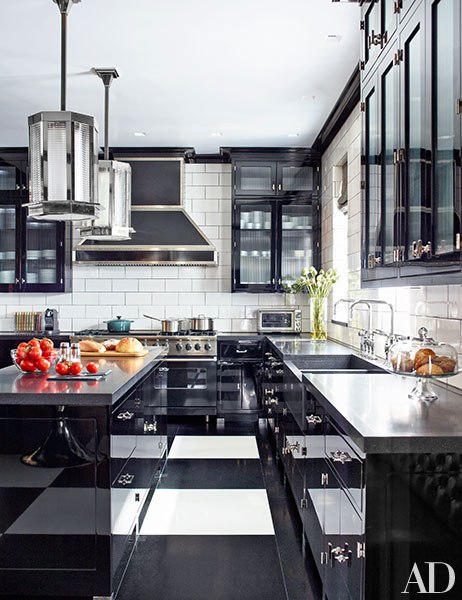
Viking Professional Range Appears in Architectural Digest, February 2015

Text by Christopher Mason
Photography by Eric Piasecki
Produced by Howard Christian
When the couple bought the apartment, there were actually two living rooms, as the building's original residences were endowed with twin parlors. While Gambrel favored keeping both, the clients, he says, "thought I was crazy." So he split one in half, crafting a dashing library—with old-style millwork made sleek and contemporary thanks to a lustrous peacock-blue finish—and a cozy study paneled and beamed in natural pine. The latter space, in particular, was "designed to feel like it had always been there," Gambrel says. And it does. "The study's our favorite spot to hang out," the wife remarks.
As for furnishings, Gambrel guided the couple toward select Art Deco pieces and midcentury designs by Jansen, William Haines, Paolo Buffa, Aldo Tura, and others, which he interspersed with his own custom-made creations. "It was such a fun process," says the wife. "When we didn't like something Steven proposed - which was rare - he would graciously go in another direction."

That said, there were a few instances where Gambrel was able to change their minds. At one of their first meetings, the decorator, who is known for his bravura kitchens, asked the owners if they would be open to doing theirs in black. "Our initial reaction," the wife recalls, "was a quick no." But Gambrel eventually won them over with his scheme of black-lacquer cabinetry, honed-black-granite counters, and a black-and-white floor in an oversized checkerboard pattern. " We loved the idea of the floor," the wife says, "as it felt like a traditional detail with a modern twist." A red L-shaped banquette, ideal for casual dining, provides a jolt of color.


