Careful Craftsmanship Maxes Out Space and Potential of an Atlanta Home By Becky Harris, Houzz
A great strategy when looking for a fixer-upper is to begin working with an architect who understands your needs while you are house hunting. That’s exactly what this couple did. They knew the location they wanted, as they already lived nearby, and they were fans of the Craftsman style prevalent in Atlanta’s Virginia-Highland neighborhood. When they found this one-story bungalow, the team at Renewal Design-Build determined it could meet the clients’ renovation wish list while maintaining the integrity of the home’s style.

Photos by Jeff Herr Photography
Houzz at a Glance
Who lives here: He’s a world-renowned marine biologist who teaches at Georgia Tech. She is in the commercial roofing business.
Location: Virginia-Highland neighborhood of Atlanta
Size: 2,609 square feet (242 square meters), including a new 652-square-foot (61-square-meter) second-story addition; four bedrooms, three bathrooms
Year built: 1925; this renovation was completed in 2015
The homeowners already lived in the neighborhood, but they wanted to be a quick walking distance from the best block of restaurants and shops. They hired Renewal Design-Build while they were house hunting so the firm could let them know the renovation potential for different properties they found. The idea was to be in the right location and customize a home to have all the things they wanted, such as custom built-ins, space for entertaining, upstairs laundry and an extra-special master suite. “We chose this home because it had good bones, had been well taken care of, had no water damage and was brick,” says architect Brent Potter of Renewal Design-Build. “We saw that we could pop up the second floor and stay within the setback lines.”
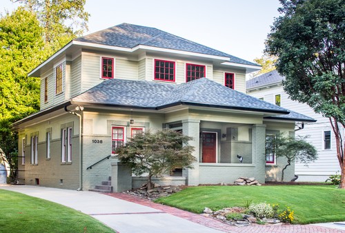
Potter was careful to respect the massing and proportions when planning the second-floor addition. He was able to do it within the setback guidelines, in some spots by only a few inches. “The homeowners wanted to be able to move in as quickly as possible, and getting the permits, had we gone over the setbacks, would have taken an extra four months,” he says. He also was careful to respect the Craftsman-Prairie style of the home, creating an addition that enhanced it. For example, the deep overhangs are the same. He removed the screens on the porch to open it up, and found divided casement windows that complement the existing double-hung windows on the first floor. The homeowners were concerned about curb appeal. The house, on a street that was once mostly one-story homes, is now flanked by full two-story houses on either side and needed to fit the scale of the streetscape. The first-floor exterior changed very little except for the placement of the front door. “When you’re adding a second story, finding the right spot for the staircase can be the most challenging part of the layout,” Potter says. To get it right, the door was moved from the center to the left. Because this is a front porch kind of neighborhood, it was fortuitous that this also left room for a bench that faces the street. “Opening up the porch made it more welcoming,” Potter says.
Exterior paint colors: first-floor brick: Svelte Sage 6164; first-floor stucco, second-floor siding: Grassland 6163; soffits, casings and other trim: Shoji White 7042, all Sherwin-Williams
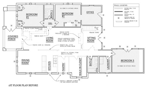
BEFORE: Note the dashed lines, which represent walls that previously had been removed. The home, which had once been made into a duplex, had been renovated several times over the years, so little of the original interior architecture was left. The most recent renovation had left small, chopped-up spaces. Opening up the public areas to one another and to the backyard was a priority, and gave the home an easy flow while letting in lots of light. The new plan is conducive to having big groups over. “These clients love to entertain. There are people over there at least two nights a week, and they often have groups of 30 to 40,” Potter says.
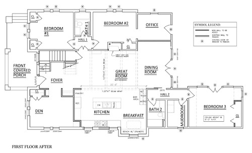
AFTER: Worth noting are the new staircase and the removal of walls between the dining room, living room and kitchen. The new design is open and light and expanded the kitchen space significantly.
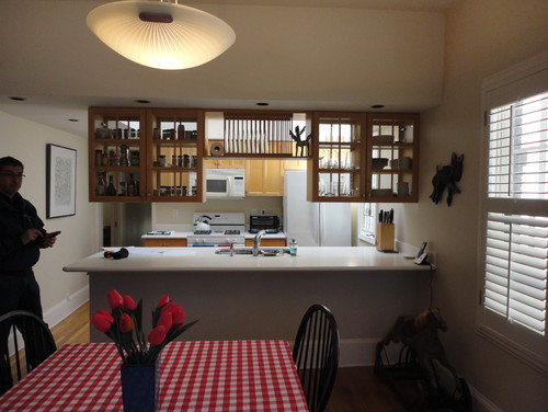
BEFORE: The kitchen had been dark and closed off. There is no “after” photo taken from this angle, but if you refer to the plans, you can see how space was stolen from an old pantry and a large walk-in closet to expand the kitchen.
The new kitchen is open to the living area but defined as a space by the beam, island and cabinetry layout. The designers wrapped the beams in hand-hewn cypress. The island’s waterfall counter has a strong presence thanks to its 4-inch-thick blue flower granite. This is a laminated edge, not solid stone. “The miters are so tight on the corners you cannot even tell that this isn’t one solid piece,” Potter says. A matching backsplash behind the vent hood ties the front of the kitchen to the back.
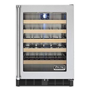
A bar complete with wine storage (room temperature and chilled), microwave drawer and coffee station creates a nice transition between the dining room and kitchen.
Stools: Zeckos

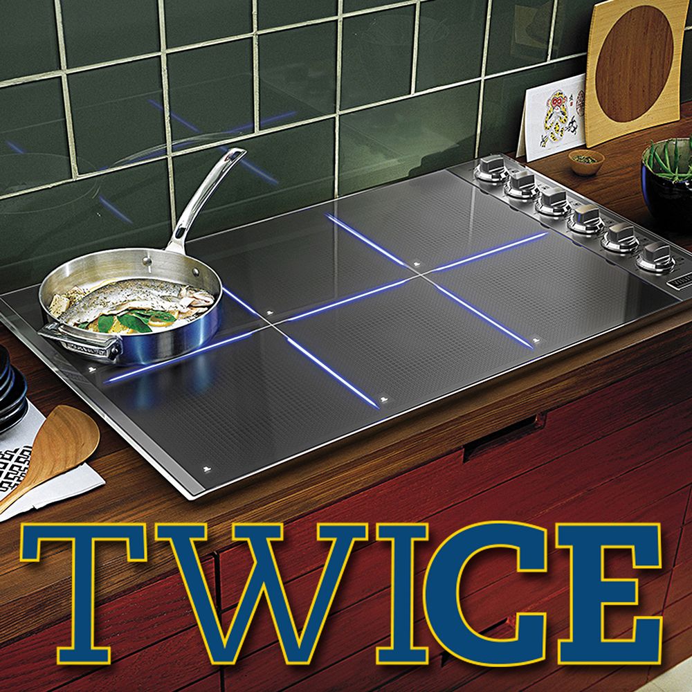
One of the homeowners is a big cook and wanted a statement range. She was excited to find this model from Viking. If she ever tires of the blue color, she can swap out the front panels for something else. The homeowners love Arts and Crafts style with a contemporary slant. For instance, the beautiful custom-made cherry cabinetry seen throughout the kitchen references the era but has modern hardware. Quartz countertops also update the look. Range: Viking
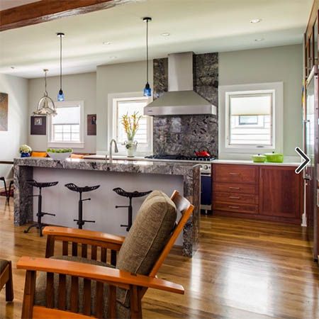
Here you can see how well the cherry bookshelves in the living room create a visual connection to the kitchen cabinetry. Also worth noting is the big view out to the backyard, now visible from all of the first-floor public spaces.

Before the renovations, this dining area was an enclosed sitting room. This cut off the great views of the backyard from the other living spaces. Paint: Conservative Gray, Sherwin-Williams; table: Paris on Ponce; lights: Cirque chandeliers, Hubbardton Forge No relaxing retreat is complete without a spa-like feeling in the bathroom. One of the homeowners wanted the cast iron soaking tub “for her happy place,” Potter says. “They wanted a place to forget about the pressures of life up here.” Bathtub: Reve 5.5-foot center-drain soaking tub in white, Kohler; chandelier: indoor five-light luxury crystal chandelier,Overstock.com
The master bath also has enough room for generous his-and-hers vanities and a separate shower stall. The floors are porcelain tile that looks like wood. “He loves wood so much, and they both appreciate the different colors and the grains in wood,” Potter says. “He would have covered the entire house in wood if he could have.” For a wet room like this, the faux wood porcelain tile is both practical and in keeping with the owners’ aesthetic. Wall color: Nuance, Sherwin-Williams; floors: Crate Collection Charred Bark, StonePeak Ceramics The glass shower enclosure is frameless, which lends a seamless look. Continuing the spa experience are three Kohler WaterTile body sprays. Each square spray houses 54 nozzles that deliver a soothing hydromassage. The designers installed the pivoting sprays based on the clients’ measurements to specifically be able to target the upper hip, lower back and shoulder blade areas.
The master bedroom enjoys the wonderful covered balcony, which has enough room for comfortable chairs. Not seen in this photo is an upstairs coffee bar, where the clients can get their morning java going as soon as they rise, and drink it while enjoying the view from the balcony. Wall color: Sagey, Sherwin-Williams