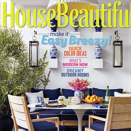
Viking Featured in House Beautiful Magazine Kitchen of the Month, June 2014
Kitchen of the Month
Design by Curated
Interview by Christine Pittel
Photographs by Joshua McHugh
Christine Pittel: I'd forgotten how good dark wood can look. What made you choose it?
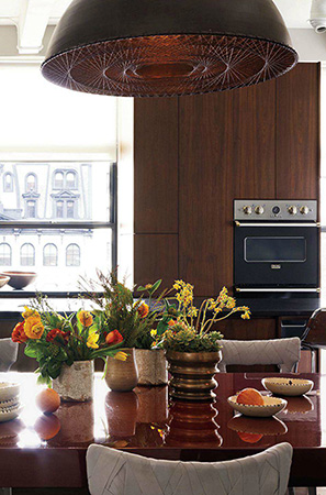
Elena Frampton: This kitchen is in the center of an open loft. It needed to be elegant, and dark walnut is very elegant. The richness of the wood adds character and also serves as a nice backdrop to the food.
White kitchens are so ubiquitous these days that dark wood seems almost revolutionary.
The darkness was an immediate instinct. It gives you this moment of intensity, whereas white can go very chilly and very bland. My partner, Delta Wright, and I tend to use dark elements as features. Some people shy away from darkness and think it's too bold. But for us, darkness recedes. There's a quietness that comes with it. And the walnut gave us the opportunity to be modern as well as warm and tactile, all at the same time.
What's modern about wood?
It's not so much the wood itself but the way it's articulated. The forms are strong and simple, with clean, square corners. The cabinetry has a monumental quality because it's so tall - the upper cabinets are used for seasonal pieces. And it's volumetric. The cooktop is inserted into a niche that looks as if it's been carved out of the larger volume.
With dark tile as the backsplash.
Typically, we like the counter and backsplash to read as one. But here, we wanted something with more luminosity than the black granite countertops. These tiles have a little shimmer, which changes with the light.
Why did you choose a cooktop instead of a range?
The clients were very specific. Both the husband and wife like to cook at the same time, and it was important to separate the ovens form the cooktop. He's normally at the cooktop, and she's at the ovens. We did a pretty intensive appliance survey and the Wolf cooktop had features he liked, such as a grill.
And then you changed brands for the wall ovens. You're rather promiscuous with your appliances.
That's right. Most people would have bought a set, but this was not about selecting a brand. It was about selecting certain qualities. We thought of it more like furnishing a room, where you choose each piece individually. The wife had Viking ovens previously; she was familiar with them and wanted to use them again.
Why go black enamel on the front instead of stainless steel?
It's quieter. Stainless steel can be glaring, and it shows fingerprints. We paneled the Sub-Zero refrigerator with walnut for the same reason. The ability to tailor the finish of an appliance to your own space is a great advantage. Because this kitchen is open to the rest of the apartment, we wanted some of the more obvious kitchen elements to go away. The hood for the cooktop is hidden. The sink is black, so it almost disappears into the black countertops.
Even the faucet is black. Where did you find it?
It's by Blanco. Again, it's very simple in form but not too hard. It has gentle curve. Modern can mean a lot of things, and here, it's about a look that's edited and quiet but not empty and sterile.
The wood keeps it warm.
And the dark, rich palette. Modern doesn't have to be white or gray. The dining table is magenta.
How did that happen?
It's a color that complements the walnut. And for me, magenta is a neutral. It goes with anything you put on it.
What's hanging above it?
Two huge light fixtures. Each is a very aggressive steel drum with this delicate silk thread strung across the opening to serve as a light diffuser. I just love that play of masculine and feminine. It feels very modern as well.